
As kids around the world are going back to school this week, parents ache silently in anxiety over how many uninterrupted work days they are going to get, before they get called into school to pick up their children again.
This autumn class presence is surrounded by controversy and uncertain and many are getting mentally prepared to have their children at home for any number of days this school year.
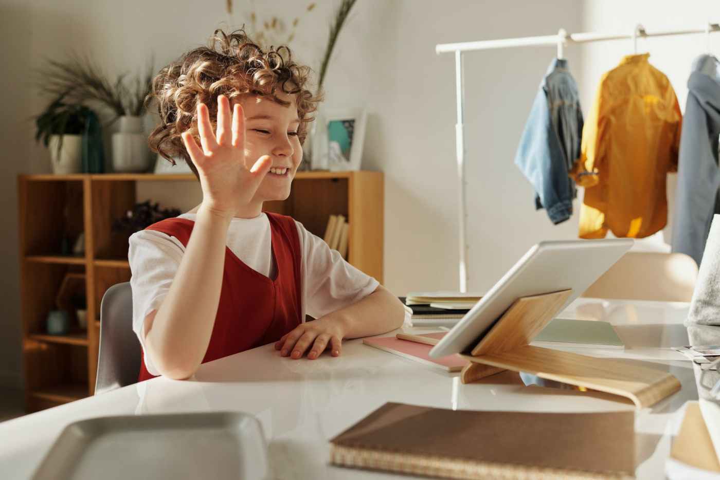
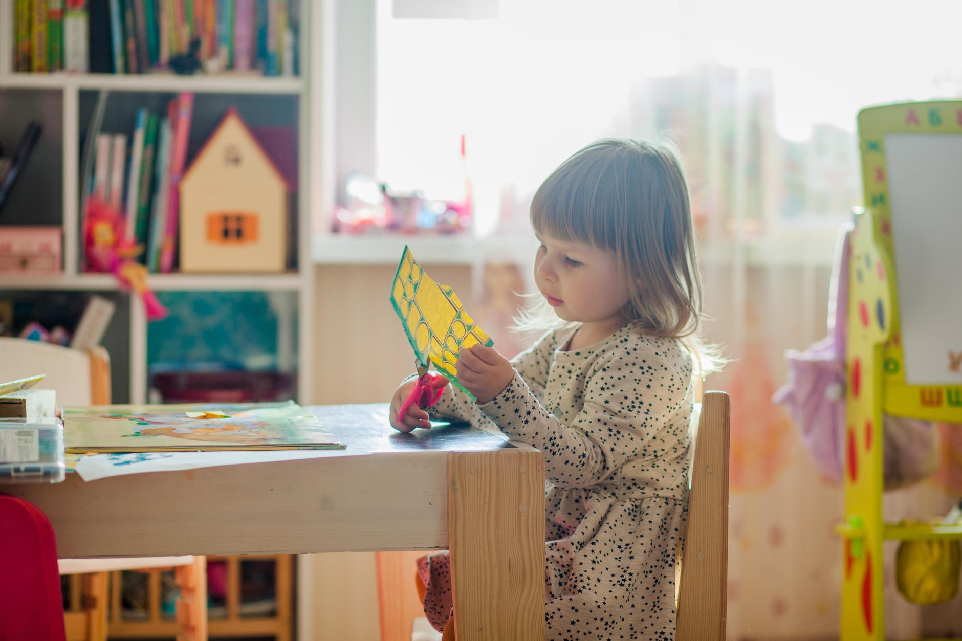
More than ever improvised classrooms or studying rooms are high on the agenda.
So what colors to include and what colors to avoid when decorating your children´s room?
It depends on the age and the temperament of your mini-me.
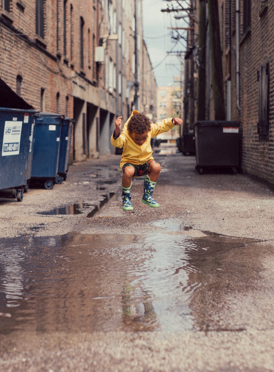
The age. If you have a toddler or a pre-schooler primary colors have been found to stimulate playfulness and activity. If you look up fotos of kinder-gardens online you will surely find bright rooms, spruced up with red chairs, blue storage trays and yellow tables. Or something to that effect. Apart from balancing each other these colors give out just the right amount of stimulation tiny humans needs to discover the world.
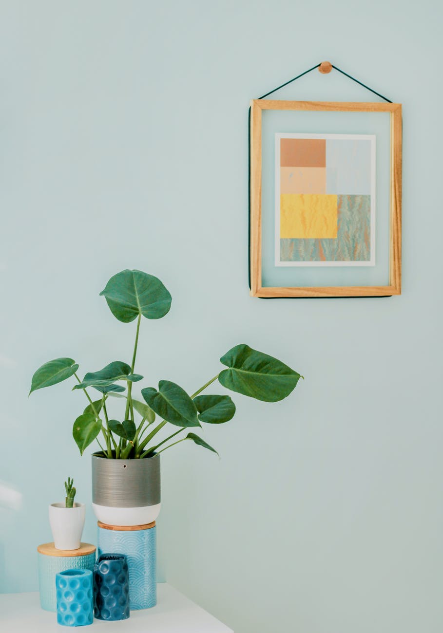
Bright primary colors can be distracting though for bigger children, so more pastel tones and less intrusive shades are recommended. Ligh blue, purple or terracota can be more appropriate for middle-schoolers.
Adolescence is usually asociated with naturally heightened anxiety so colors like bright red, teal or brown should be avoided. Kids in puberty face (perceived) intense social and peer pressure and need a safe oasis to retreat, regroup and recharge. Green and blue are universally calming colours and combined with warm yellow or orange can give the right amount of assertiveness, enthusiasm and happiness during this difficult age.
The temperament. Kids come in all shapes and sizes and have their own unique personalities. Depending on their primary characteristics though, you can subtly influence them one way or another using color.
The Dreamer. If your kid is spending more time day-dreaming than studying you may consider orange instead of pink or white, usually considered flighty. Orange is believed to promote productivity and can heighten concentration and perception of the material.
The Dynamo. If your child cannot stay still and is always on the go stay away from red which promotes physical activity and instead go for green, warm grey or blue. These cold colors ground the space and provoke serenity and concentration.
The Thinker. If your little one is more on the serious side and has the weight of the world on his or her shoulders, consider a red accent wall with more bright colors: yellow, pink and sky blue for evoking joy, movement and outside activities. Stay away from less vibrant shades like brown, teal or navy blue which may induce lethargy or apathy.
The Inventor. If your kids have very active imaginations that are preventing them from studying, try to tone down their environment in more subdued tones. Soft grey with accents in earth tones will give off a more grounding vibe and prevent excessive distractions. Avoid bright colors in big quantities. Blue can also be an option, as it serves well for ¨mundane chores¨ like homework.
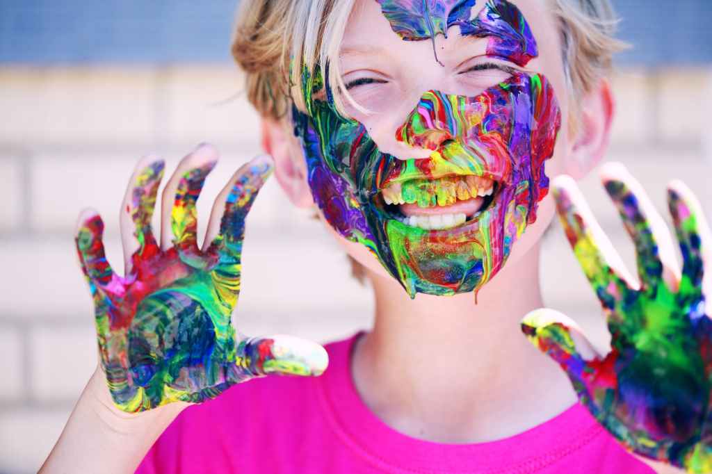
The Artist. If your children are artistically inclined in any way, the best colors to use are yellow and purple. Purple is said to provoke inspiration and help develop artistic dexterity. Combined with yellow or orange, it promotes concentration and stamina for repetitive tasks while practicing.
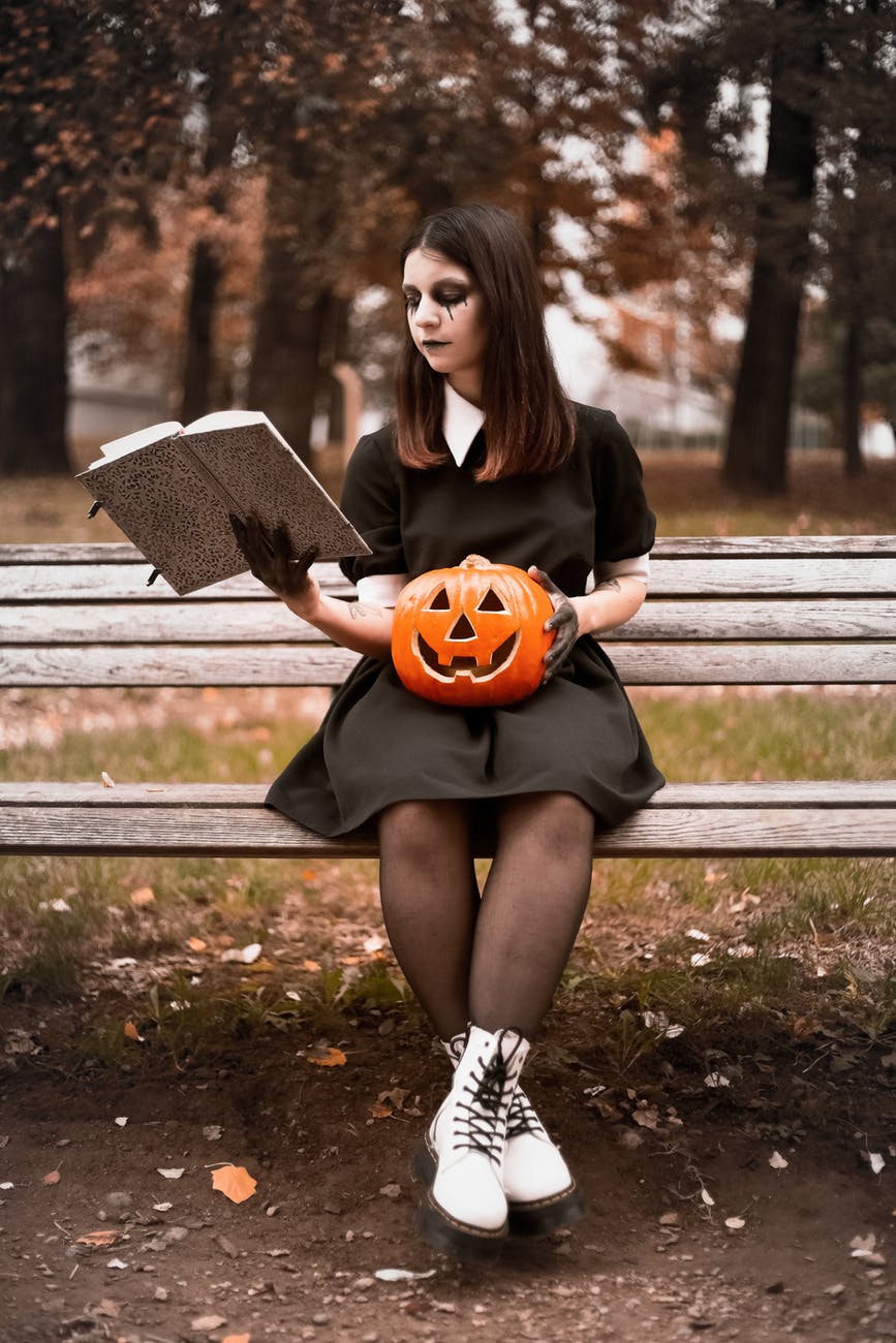
The Goth. It will be difficul to dissuade your teenage daughter or son to stay away from anything that isn´t black, but fear not. You may try to include some gold, electric blue or purple elements that are generally well accepted in the gothic realm. Also blue is believed to be great for studying math and accounting!

Leave a comment