
Two colors to watch out for this autumn
Autumn is upon us and with it the desire for cosy and inviting surroundings. Contrasting the outdoorsy summer with its leafy streets, blue skies and sandy beaches autumn invites us to slow down for more laid back at-home activities and afternoons around the fireplace with family and friends, where the aroma of forrest fruits and freshly baked pies floats in the air. Hygge they call it up north (in Denmark) – that state of mind and body that has no direct translation in English, but encompasses a wide range of feelings and emotions related to mindfulness, well-being and happiness.
Blue?
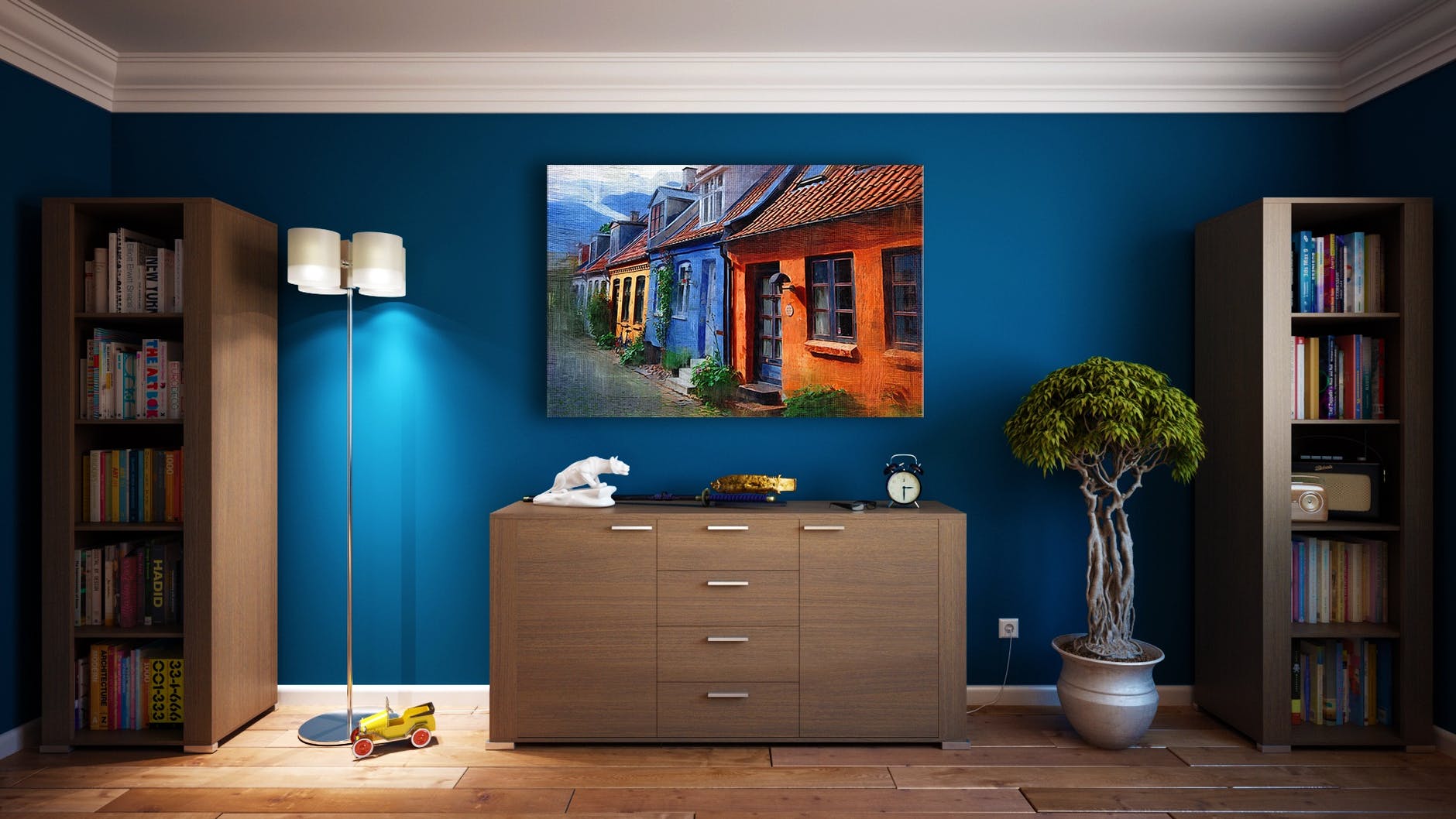
This year´s primary autumn color is not a very conventional autumn color at all. We usually associate autumn with yellow, burnt orange, brown and dark green. As we mentioned two weeks ago in Interior design and the pandemic the Pantone Color Institute declared Classic Blue as a Color of the Year 2020 and many big retail chains are prominently exhibiting it in their autumn campaigns in all sorts of tones and shapes.
Wayfair, for example, is promoting this classic shade in their bathroom and furniture collection with sharp dark blue pieces and metallic accents. Ikea uses it is as an inspiration for their linen collection, while Jayson Home and Roche Bobois feature their signature style sofas in rich dark and petrol blue shades.
Blue is a symbol of stability and dependability and in autumn it evokes feelings of being enveloped and secure. It is an intense and enigmatic color that promotes serenity, sophistication and profound calmness.
Brown!
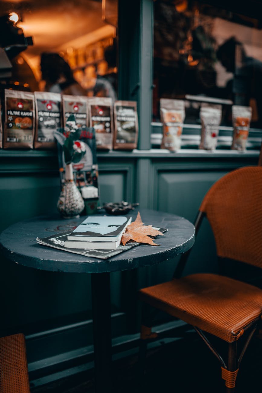
There is hardly any other season apart from fall that invites for all things brown. Deep chocolate, dark cocoa, mocha, mahogany, café, topo – associated with wood and one of nature´s warmest and most wide-varied colors inspires safety, comfort, stability and tradition.
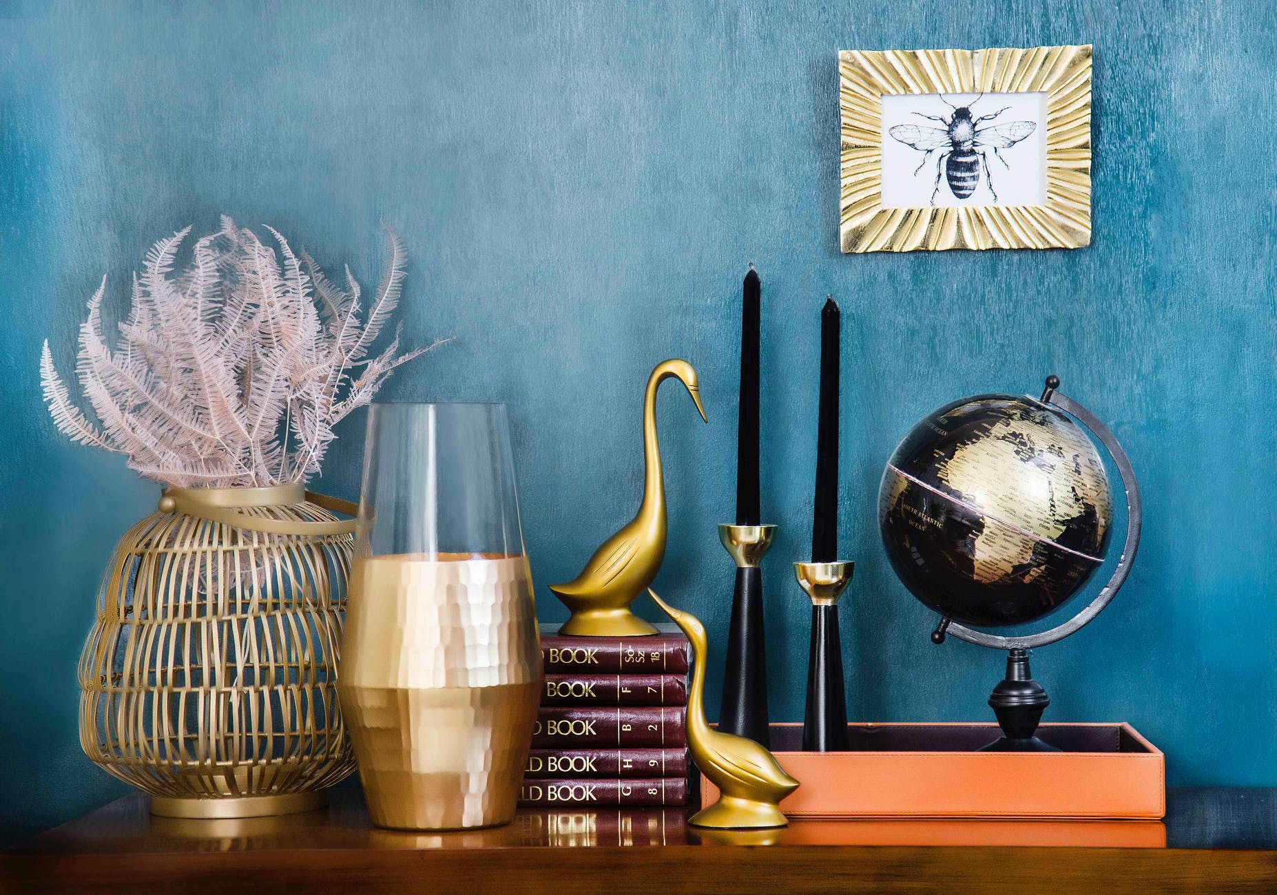
Most people do not perceive blue and brown as a naturally good combination. Brown is an earthy tone present just about everywhere in nature, while darker blues are almost impossible to find (blue ocean and delicious blueberries apart). Yet they can be craftily orchestrated into a sophisticated design using more ¨easy-going colors¨ like mustard, indigo, wine, and terracotta.


Leave a comment